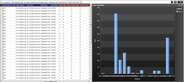
Component Builder
Available from 4.4.4
Components are required to be able to create dashboards. A component can be a chart, gauge or grid. Once the component has been configured it can be added to a dashboard.
Components are built within the Intuitive Dashboard Designer
Settings > Intuitive BI > Intuitive Dashboard Designer
Menu >Component Builder > New Component
A new component builder will become available.
Select a Dataset
 Click to view more detail.
The dataset must be added before the component can be configured.
Menu > Select Dataset
Click Select Dataset , a pop up window with the Dataset navigator will open, from the folder structure select the required Dataset.
The Component can now be configured by setting the Chart Component and dragging in Attributes and Measures from the Dataset.
Chart Components
Click to view more detail.
The Component Type must be selected before attributes and measures are added, otherwise data will be lost. The dataset will automatically be divided into attributes and measures, the Component Type picked will set conditions on the amount of attributes and measures that can be added.
Component > Settings
Select either Grid, Chart or Gauge.
- For Chart components there can only be one blue attribute at any one time, selecting a different attribute overwrites the previous one. There can be multiple measure values in a chart and every measure column adds to the total number of series displayed in the chart.
- For Grid components the measure fields are displayed as a table and as such can accommodate as many attribute and measure columns as the user sees fit.
- For Gauge components only one measure column can be selected from the Dataset.
Adding Attributes and Measures
Click to view more detail.
A Dataset is spilt into two column categories, Dataset columns with a blue header are attributes, Dataset columns with a red header are measures.
Blue Attribute columns contain descriptive information e.g. names dates and descriptions.
Red Measure columns provide results calculated form the column values e.g. sum or count.
Columns are added by dragging the column header into the component builder
Applying Filters
Click to view more detail.
Data can be filtered to ensure only the required values shown.
Component Builder > Settings > Filters
A pop up window will appear that will allow filters to be applied.
Select the column to filter, Select the Operation to filter by, add the values -one value can be added at a time but multiple filters cab be applied.
Set Title
Click to view more detail.
A Title can be added to the component.
Component Builder > Settings > Set Title
A pop up window will appear that allows a title to be entered.
Series Display Options
Dependant on the component type there will be a number of display options.
Click to view - Chart Options - options vary dependant on Chart Type
Axes, Sort, Labels
Click to view more detail.
Titles, font size, axis label orientation, sorting orders and legends can all be altered here.
Component Builder > Settings >Axes, Sort, Labels
Colour Scheme
Click to view more detail.
Components can have either a dark or light background, these are set here.
Component Builder > Settings > Colour Scheme
Saving the Component
Click to view more detail.
Once built the Component must be saved .
Menu > Save Component
Component Drill Down
Click to view more detail.
Component drill downs allow a part of the component to be clicked on to drill down into more details - this will be filtered by the parent component.
Menu > Add Component Drilldown
Drill down components are built in the same manner as Components. Repeat the steps to build the Drilldown component.